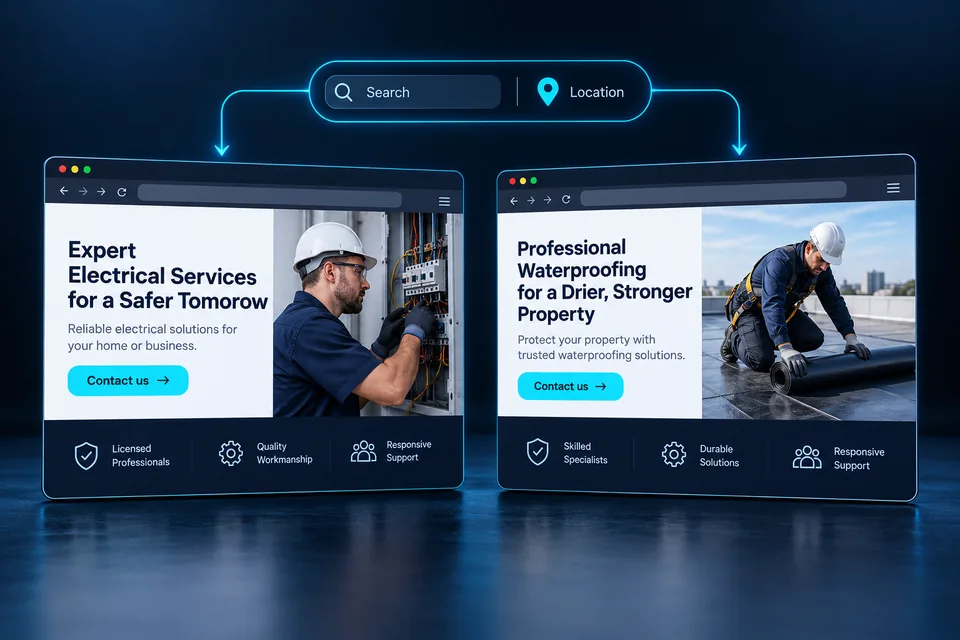

A strong landing page must load and respond quickly while giving people a reason to move forward. A beautiful page that arrives late misses the moment. A fast page with an unclear offer leaves visitors guessing. Plan performance and the conversion journey together from the first brief.
Define what visitors need to see, understand and do, then build a clear, reliable route. Speed removes friction; messaging, evidence and experience create reasons to inquire. Judge success through qualified leads and progress toward sales.
1. Define business success first
Before choosing colors or a platform, define the page's job. An emergency service needs a different journey from a complex project provider. One visitor may want immediate contact; another needs previous work, process details and a fit assessment.
Define the primary action, relevant audience and what makes an inquiry qualified. It might be a discovery request from a business needing a new page, or a service request within actual coverage. That definition shapes copy, questions, evidence and the information passed to your team.
Write four answers: who arrives, what they need, what you offer and what happens after submission. Resolve any disagreement within the team before design begins.
One coherent experience.
- 01 / MESSAGEA clear offer.
Relevant messaging. Value people understand.
- 02 / EXPERIENCEEasy to stay and move forward.
Fast loading. Purposeful motion. Stable design.
- 03 / CONVERSIONA straightforward next step.
Clear action. A usable form. Reliable follow-up.
Plan together. Test in practice.
2. Make the first screen immediately understandable
The opening should feel relevant: “This answers what I was looking for.” The headline identifies the service or desired outcome; supporting copy adds context; proof reduces doubt; the button explains the next step. Not every detail belongs above the fold, but the core offer must be clear.
“Your business's future starts here”
It does not explain the offer, audience or next step.“Landing pages for service businesses, with messaging tailored to what customers need”
Possible supporting copy: strategy, design, development and CRM integration.“Let's find the right approach for your business” can fit a discovery call. If a scheduling button opens a callback form, explain that details are used to arrange a time. Matching words to behavior builds trust before the conversation.
Show the opening to someone unfamiliar with the business. Ask what is offered, who it fits and what happens after clicking. This uncovers vague messaging before production.
 User experience
Plan the message, evidence and next action as one continuous experience across screen sizes.
3. Build a sequence that answers buying questions
A conversion-focused page is more than attractive sections. Each part should build understanding or resolve a concern: the service, relevance, process, credibility, deliverables and next step. Let real customer questions determine the order.
- Offer: a clear service connected to the need.
- Value: what changes for the customer and how your work helps.
- Evidence: real projects, verified reviews or expertise readers can assess.
- Process: stages, responsibilities and expectations.
- Reassurance: answers about fit, cost, maintenance and ongoing work.
- Action: a clear invitation to talk or request an estimate.
Repeat the primary action after meaningful decision points. Consistent buttons help visitors recognize the path when ready; each does not need a new sales pitch. Use descriptive headings, focused paragraphs and scannable examples on longer pages.
Let decision-making needs determine length. Remove repetition while keeping useful answers. Organize detailed material or link to a guide instead of deleting it solely to shorten the page.
Our guide to what a landing page should include provides a starting sequence. Then adapt it to the service: a locksmith landing page should make service details and contact especially easy to find on a phone.
4. Define speed with measurable targets
“It loads quickly for me” is not enough. Start with the three Core Web Vitals, covering loading, responsiveness and stability. Their good-experience thresholds are:
Time until the largest visible image or text block appears.
Responsiveness to interactions measured throughout the visit.
A unitless measure of unexpected layout shifts.
Assess the 75th percentile of visits separately for mobile and desktop. These are experience targets, not conversion guarantees. Lab scores help diagnose issues but do not replace real-user data. Web Vitals definitions and targets — opens in a new tab ↗
Document test conditions: page, device, network, first or repeat visit and active components. Consistent conditions make before-and-after comparisons useful.
5. Choose technology around the page's needs
Custom code, a CMS or a page builder can all work. Choose based on maintenance, editing, personalization and integrations. A technology's name alone does not establish performance.
Make core content available early. Headlines, offers and inquiry paths should not wait for an intro animation or several external services. Review what loads initially and what can wait. Redirect chains can also delay rendering.
Structure the project so messages, proof and test versions can change without rebuilding everything. Separate content, design and integrations appropriately, and ensure the maintainer understands the architecture.
Technology choices include lead capture and ongoing maintenance. Our landing page development guide covers integrations, error scenarios and acceptance criteria to define up front.
Include editing and maintenance ownership in the platform decision. Our comparison of WordPress, Elementor and Wix landing pages focuses on business needs rather than template appearance alone.
 Development & infrastructure
Behind the experience are the code, integrations and tests that keep a page working over time.
6. Prioritize the opening content
If the hero image is the LCP element, the browser should discover it early. Avoid lazy-loading it or hiding its URL behind scripts. Use an appropriate priority hint after identifying the actual critical resource.
Review server response, image discovery, download duration and render delay. Compressing a file will not fix an animation or script that keeps it hidden. Diagnose the entire chain. Diagnosing and improving LCP — opens in a new tab ↗
The opening-screen brief should also define lower priorities. A deep-page gallery, video player or map need not compete with the headline and offer. Loading order should follow importance to the reader.
7. Keep image quality without unnecessary downloads
High-quality images need not use identical dimensions on every device. Prepare responsive versions and let the browser choose through srcset and sizes. Check crops too: a desktop landscape image may need different composition on a phone. Responsive image guidance — opens in a new tab ↗
Compare the size and visual quality of WebP or AVIF with the original. Inspect small text, logo edges, skin and gradients. Aggressive compression that damages brand details may be a poor tradeoff.
- Keep important headings and copy as live text.
- Choose images that explain or support the offer.
- Defer below-the-fold images that are not needed initially.
- Check images added through the CMS, not just launch assets.
A video poster and play button can load the full player only when requested. This gives visitors control and avoids the immediate cost of a component they may never use.
 Design & hierarchy
Color, spacing, imagery and typography create a hierarchy that guides attention to what matters.
8. Prevent layout shifts and keep text readable
A button moving just before a tap makes even a fast-looking page feel unreliable. Reserve space for images, videos and embeds using dimensions or aspect ratios. Test late-loading banners and dynamic text variations too.
Font swaps can change line lengths. Choose a suitable fallback and loading strategy, and check that the final font does not significantly move content. Preventing layout shifts: CLS guidance — opens in a new tab ↗
Check typography across devices, including numbers, punctuation and mixed-language brand names. Load only the weights the design uses and leave comfortable line spacing. Enlarged text should not hide buttons or clip fields.
Design error, sending and confirmation states in advance. The layout should remain orderly when validation appears beneath a field, not only in the ideal design mockup.
9. Design effects that support action
Animation can explain personalization, show progress or acknowledge an action. Ask what users understand because of the motion and whether they need it now. An entrance effect should not delay text or block a button.
Limit long JavaScript tasks and break up heavy work. Inspect dialogs, menus, animations and third-party tools running during interaction. Deferring downloads alone does not help if execution later freezes the interface. Improving interaction responsiveness — opens in a new tab ↗
Inventory analytics, chat, maps, video and other third-party components. Give each a purpose, loading time and owner. Remove duplication and test the real launch configuration, not a clean demo without its production integrations.
Offer reduced motion, preserve natural navigation and keep the page functional without effects. On mobile, precision and immediate response can be more impressive than another animation layer.
10. Personalize without adding confusion
Dynamic pages can adapt messages to a campaign's service or area. The value comes from a relevant answer: a headline, explanation, example or form question. A city-name substitution alone will not make a generic offer relevant.
Prepare approved versions and map them to known values. Avoid briefly displaying the wrong headline before a dramatic swap. Provide a complete default for direct visits, unknown links and failures.
A locksmith might offer separate lockout and cylinder-replacement journeys. One addresses an immediate need; the other explains compatibility and process. These illustrate content planning, not unverified availability, prices or outcomes.
Pass confirmed context to the form and let customers correct the service or area. Configure caching so one visitor's variant is not served incorrectly to another. Read how dynamic landing pages work for more.
11. Turn the call to action into a reliable journey
Choose a primary action and explain its outcome. Collect the information that step needs. Some businesses need only a name and number; others need service and location to qualify inquiries. Shortening a form is a business decision, not an automatic rule.
Use persistent labels, appropriate input types and relevant autofill. Phone fields can offer a suitable keyboard; name and email fields can use saved details. Form field and autofill guidance — opens in a new tab ↗
Validate on the server, prevent duplicates from repeated clicks and confirm success only after the inquiry is stored. If CRM delivery fails, provide recovery and staff notification instead of hiding a lost lead behind a success message.
On errors, preserve entered details, explain the problem and offer a next step. After submission, describe the actual follow-up process. If phone or WhatsApp are alternatives, label them clearly and verify the links.
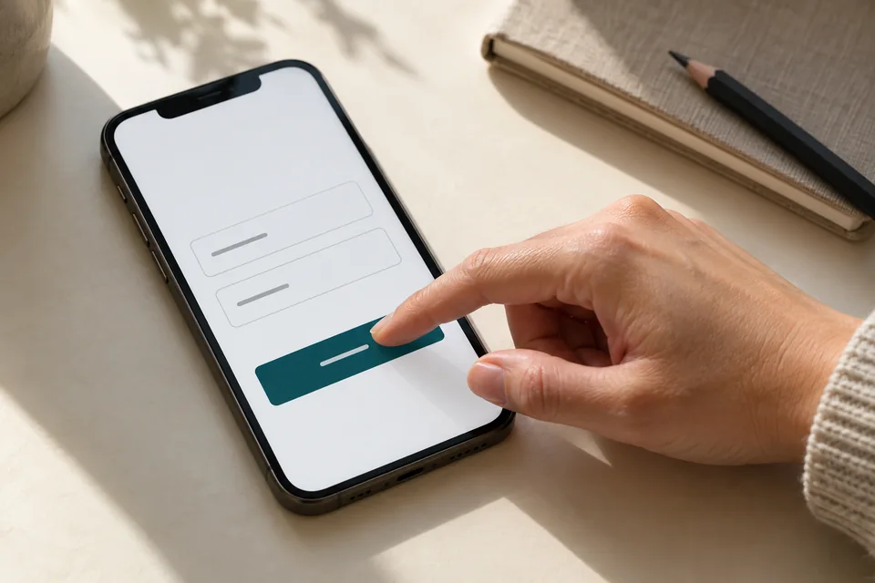 Mobile forms
Start with the information needed for the next conversation. Mark optional fields, explain what happens after submission and make buttons easy to tap.
12. Design the mobile experience deliberately
Shrinking desktop layouts is not enough. Phones have less space, on-screen keyboards and sometimes weak connections. Order the offer, short explanation, proof and action by importance. Strong imagery should fit that sequence.
Test one-handed form entry on a real device. Can users reach the next field? Does a floating bar cover Submit? Do menus, privacy controls and accessibility tools compete for the same corner? Assess the complete experience, not isolated components.
- Headlines wrap sensibly and copy is readable without zooming.
- Buttons have comfortable tap areas and enough separation.
- Content flows without unnecessary horizontal scrolling.
- Keyboard users can navigate and identify focus.
- Errors and confirmations are understandable without relying on color alone.
Recheck the inquiry journey after significant changes. A new gallery or headline can alter pacing and push the form down even when the form itself was untouched.
13. Measure the path from visit to qualified inquiry
Define separate events for visits, form starts, accepted submissions, qualified inquiries and progress to calls or sales. Button clicks are useful but not equivalent to saved inquiries. Opening WhatsApp does not prove a message was sent.
CRM integration reveals what happens after the initial conversion. Source and page-version identifiers can connect to lead quality under appropriate privacy settings. Keep names, phone numbers and inquiry contents out of URLs and free-text analytics fields.
If 1,000 visits produce 40 inquiries and 20 qualify, inquiry conversion is 4% and qualified inquiry conversion is 2%. A version producing more forms but fewer qualified inquiries has not necessarily improved business performance.
Compare similar devices, traffic sources, services and periods. Keep visit and conversion definitions consistent and document campaign changes. This helps distinguish a page problem from an audience change.
 Measurement & conversion
Separate visits, actions and qualified inquiries to identify what really needs improvement.
14. Test before launch and learn afterward
Lab tests identify issues before traffic arrives. Field data reflects actual devices and networks. In PageSpeed Insights, distinguish URL-level data from origin-level data. New or low-traffic pages may not have enough field data yet.
Test important paths: visits with and without parameters, validation errors, valid submissions, repeat clicks and CRM delivery. Include first visits, long scrolling and state changes. The team should know how to detect problems and restore a working version.
After launch, choose one improvement hypothesis—for example, explaining scope near the form may help qualified visitors proceed. Define success and quality metrics in advance and compare similar traffic. A fluctuation of a few inquiries is not proof of a winner.
When traffic cannot support a useful quantitative test, start with usability sessions and customer conversations. Fix clear obstacles while collecting data. See conversion optimization with dynamic landing pages for more.
15. The launch handoff checklist
Before directing spend to the page, use one checklist connecting marketing, design and development. “Looks good” is insufficient. Assign an owner to verify each item in the version that will go live.
From the brief to a received lead
- The audience, offer and primary action are defined.
- The opening makes sense to someone unfamiliar with the business.
- Evidence is authentic, relevant and authorized for use.
- Performance targets and test conditions are documented.
- Images fit the screen and the layout stays stable.
- The form and alternative contact paths have been tested on mobile.
- A test inquiry was stored and reached the right owner.
- Every dynamic scenario has a working fallback.
- Measurement distinguishes clicks, inquiries and qualified inquiries.
- Maintenance, issue monitoring and an improvement process are defined.
The professional work is connecting these decisions: design that understands the message, writing that understands the audience and development that supports performance and reliable lead handling. Improve from there using actual business outcomes.
A landing page build should combine speed testing with content approval and the business workflow. Our launch guide makes those checks part of handoff rather than an afterthought.
Questions about speed, design & conversion
Does a fast page guarantee a high conversion rate?
No. Speed removes friction, but relevance, the offer, trust and the process still affect decisions. Measure technical performance alongside qualified leads and sales progress.
Do we have to use custom code?
Not necessarily. Choose around requirements, maintenance and integrations. Custom code still needs optimization; a CMS still needs testing. Evaluate the actual result.
Can premium design and animation coexist with speed?
Yes, with careful asset sizes, timing and responsiveness. Prioritize important content and actions, give motion a purpose and test mobile and reduced-motion experiences.
Should we chase a perfect PageSpeed score?
A lab score is diagnostic. Fix issues affecting users, compare consistent tests and review sufficient field data. The score alone does not measure business success.
Is a longer page necessarily slower?
No. Asset weight, loading behavior and browser workload matter more than section count alone. Rich pages can prioritize important content and defer nonessential media.
What should we check first on an existing page?
Start with a working inquiry process and a clear offer, then review mobile usability and major performance issues. “Why landing pages don't convert” helps identify where visitors stop.
Images in this guide were created with AI for illustration. They do not depict actual clients, team members or campaign results.