The campaign brings visitors, the design looks polished, yet the phone barely rings. Or forms arrive from people who are not a fit. In either case, a new page may seem like the obvious answer. Before starting over, identify where the connection with the customer breaks down.
A converting page connects visitor intent, a clear offer, credible evidence, and an easy next step. Meaningful improvement starts with the obstacle and is measured through lead quality and progress toward a sale as well as volume.
Before redesigning: what exactly is not working?
“The page does not convert” can mean too few visits, little interest in the offer, abandoned forms, or inquiries that never become conversations or customers. Each needs a different response. A button color will not fix irrelevant traffic, and a bigger budget will not repair a broken form.
Define the conversion clearly: a successfully stored inquiry, a completed call, a scheduled meeting, or a sale. A WhatsApp click shows intent, but does not prove a message was sent. Measure each stage separately to see where work is needed.
Four questions that locate the problem
- Too few visits
- Check reach, budget, targeting, and problems accessing the page.
- Visits without inquiries
- Check search relevance, the offer, trust, and usability.
- Poor-fit inquiries
- Check the audience, promises, service area, and qualification questions.
- Inquiries without sales
- Check lead quality, response availability, follow-up, and commercial fit.
There is no universal conversion rate for every business. An emergency locksmith call, a remodeling estimate, and a professional consultation are different decisions. Compare similar sources, devices, services, and periods. A small sample or a few unusual days cannot support a firm conclusion.
- 01ClickIs this person a fit for the offer?
- 02InterestDoes the message address the need?
- 03TrustIs there a reason to believe?
- 04InquiryIs the next step easy?
- 05SaleIs there effective follow-up?
Every stage asks a different question.
1. The visitors are not the audience the page was built for
Even an excellent page struggles when visitors want something else. General AC repair research differs from a search for a local technician. An ad promising the lowest price may attract the wrong audience for a premium service. Reaching people outside your territory produces leads you cannot serve.
Review actual search terms, ad messaging, and the inquiries received. Segment into actionable groups: services, regions, campaigns, and devices. A single aggregate figure may hide one group performing well and another wasting budget.
2. The ad's promise disappears after the click
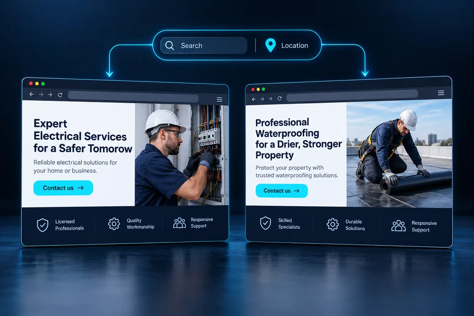
Someone searching for a lock cylinder replacement in Haifa, Israel, wants immediate confirmation that the page fits. A generic headline such as “Advanced solutions for homes and businesses” makes them connect the dots themselves. More unanswered questions make an inquiry harder.
The first screen should identify the service, audience, and available next step. Good message matching continues through the explanation, examples, questions, and button. Google recommends landing pages relevant to ads and keywords, with straightforward navigation.
Source: Google Ads—matching ads and landing pages ↗“Experts in every locksmith solution”
The customer still has to find out whether the service fits their need.“Lock cylinder replacement in Haifa. Let's check the right fit for your door and needs.”
Next-step button: “Ask about cylinder replacement.”Mention locations, availability, prices, and credentials only when accurate for the business and situation. Clear, deliverable expectations also improve the conversation after the form.
 From ad to landing page
An ad sets an expectation. The page's image, headline and offer should continue that conversation and make the next step clear.
3. The offer sounds good, but the deliverable is unclear
“Professional service,” “uncompromising quality,” and “personal attention” may be true, but do not explain what customers receive. Visitors want to know what is included, how to start, what they need to provide, and how to assess fit. Larger decisions also raise questions about process, price, and warranty terms.
Describe the offer through the first step and its realistic outcome. For example: “On our introductory call, we will discuss the services you want to promote, the audience you want to reach, and where your current page may be losing inquiries.” That explains the call's value without promising an untested business result.
- What you receive: a defined service, deliverable, or project stage.
- Who it suits: the business type, need, area, or project scope.
- What happens after the inquiry: who responds, through which channel, and why.
- What affects the price: useful details when pricing depends on scope.
If you publish a starting price, explain what it includes and what may change it. If there is no standard price, explain the estimating process instead of leaving only “submit your details.”
When the reason to choose your business is unclear, changing the button color will not solve it. Our landing page differentiation and value proposition guide connects relevant advantages with evidence.
4. The page asks for trust without enough evidence
Before sharing a phone number, people want to know who is on the other side. Good branding creates an impression, but reducing uncertainty also requires facts: the business, the people providing the service, contact options, and relevant experience.
A useful review describes the customer's need, the work, and the experience. A useful portfolio shows a real project and explains the decisions behind it. Performance claims need context: what was measured, when, and under which conditions.
Place evidence beside the question it answers. Show relevant work near the service description; explain data handling near the form. You do not need to pile all the proof into one section.
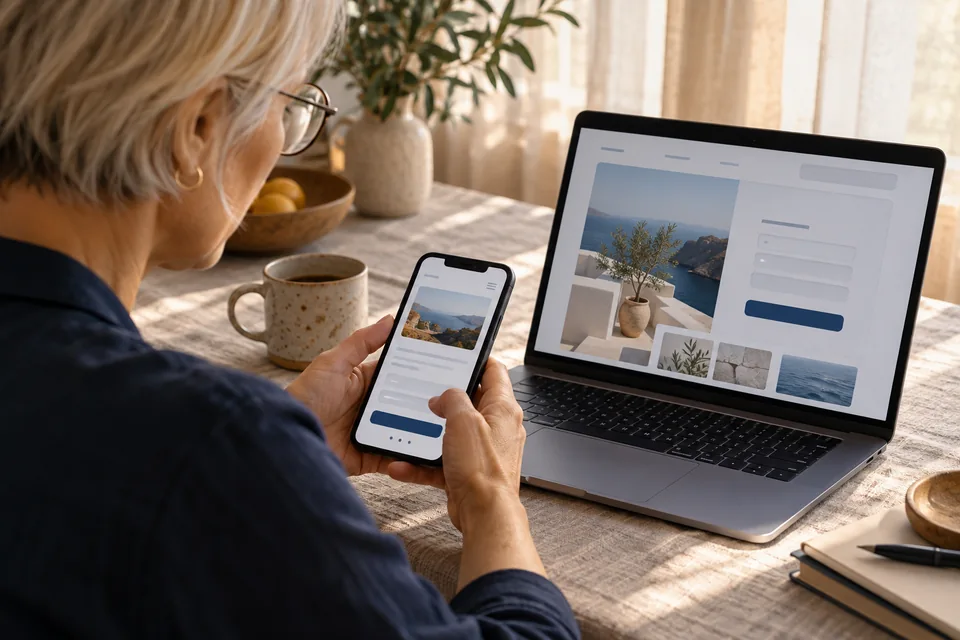
 Portfolio & proof
A real business should show its own work, explain what was delivered and highlight relevant details. This image illustrates one way to present a portfolio.
5. The design attracts attention but does not guide the decision
An impressive page can still demand unnecessary effort. When everything is large, glowing, or moving, it is hard to identify what matters. Repeated sections with nearly identical layouts can also blur the progression from offer to evidence to action.
Create a reading sequence: a headline defining the offer, a short explanation, relevant evidence, and a next step. Use scale, spacing, contrast, and imagery to guide attention. Motion should support the message without blocking reading or interaction, with an option to reduce or stop it.
The right length depends on the decision. A simple urgent service may need a short path; an expensive or complex project may need detail. On long pages, give every section a purpose, use scannable headings, and return to the call to action after meaningful information.
Our landing page design guide covers hierarchy, readability, and action flow. Use it to assess whether design reinforces the offer or competes with it.
6. The call to action and form create friction
“Submit” describes a technical action. “Request an Estimate” or “Request a 15-Minute Introductory Call” explains what visitors will receive. The button should be readable, accessible, and prominent, and the next step must match its promise.
Define one primary action. Phone and WhatsApp can provide alternatives, especially for urgent services, while retaining a clear hierarchy. If the button opens a callback form rather than confirming a time, explain that the details are used to arrange the call.
Every field needs a purpose. A name and response channel are a starting point; location or service questions can prevent poor-fit inquiries. Move unnecessary questions to the conversation. Automatically shortening every form does not guarantee better leads.
- Use persistent labels and errors that explain how to fix the problem.
- Preserve completed fields when another field needs correction.
- Use the appropriate mobile keyboards for phone and email fields.
- Show submission progress and confirm success only after receipt.
- Briefly explain why information is collected and what happens next.
A multistep form can organize questions but also adds transitions. Measure actual completion and lead quality, and show the number of steps upfront.
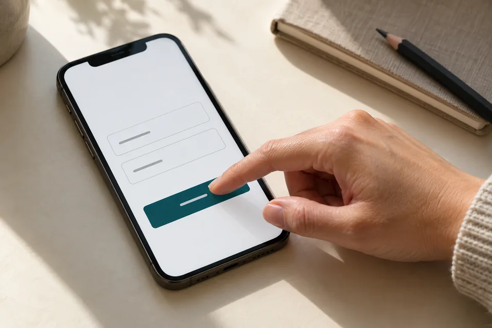 Mobile forms
Start with the information needed for the next conversation. Mark optional fields, explain what happens after submission and make buttons easy to tap.
7. Mobile usability and speed interrupt progress
A page tested only on a designer's computer may behave differently on a phone. A headline can fill the screen, an image can push the offer down, and floating buttons can cover the form. Test real devices with the keyboard open and less-than-perfect connections.
On mobile, lead with a clear message and an accessible action, then let people explore. Important content must remain available without hover. Fixed controls should not obstruct reading, and tap targets need enough room for accurate use.
Core Web Vitals provide useful performance targets: LCP at or below 2.5 seconds for main-content loading, INP at or below 200 milliseconds for responsiveness, and CLS at or below 0.1 for layout stability. Evaluate the 75th percentile of real visits, separately for mobile and desktop.
Source: web.dev—Core Web Vitals definitions and thresholds ↗Inspect heavy images, video, scripts, and loading-related layout shifts. A single lab test helps diagnose issues but does not replace real-user data. Clean code still needs to demonstrate good loading and responsiveness under actual conditions.
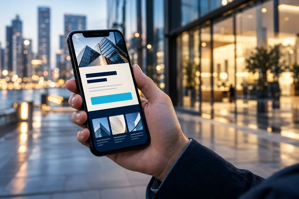 Mobile & performance
On mobile, the message and next action should be easy to find and use.
8. You are measuring clicks instead of actionable leads
A clicked button is not a new customer. Counting every click as a conversion or counting a form twice overstates performance. Excluding phone inquiries can understate it. Before judging the design, verify that measurement reflects what happened.
Define a consistent funnel: visit, form start, received inquiry, qualified inquiry, call or meeting, and sale. Record the campaign source and page version where possible and consistent with privacy choices. Use the same definitions and time windows for comparisons.
- Visits
- 1,000
- Valid inquiries
- 50—a 5% inquiry rate
- Qualified inquiries
- 20—a 2% qualified inquiry rate
This example shows why volume and fit should be considered together. More forms with fewer relevant opportunities may not be an improvement. Over time, add cost per qualified lead and sales outcomes, allowing for the time a deal takes to close.
9. The inquiry arrives, but the sales process stalls
The page can do its job without a sale following. Leads sent to the wrong person, duplicates, unclear hours, and delayed responses weaken the next stage. Check the connection between the form and the people handling inquiries.
A CRM can centralize details, answers, and source context, assign ownership, and track status. A reliable integration also handles delivery failures, duplicates, and inquiries stored successfully but not yet passed to the next system.
Define who responds, when, and through which channel. Do not promise immediate service without the staff to provide it. Record loss reasons such as location, service mismatch, availability, price, or no response. Those insights improve campaigns and page messaging.
Further reading: Connecting a landing page to your CRM workflow.
 Inquiries & follow-up
Connect each inquiry to its source, assign follow-up ownership and track qualification and the next conversation.
10. One page tries to answer too many different needs
A single page for every service, city, and customer can become too generic. Someone locked out has a different need from someone comparing replacement locks. A dynamic landing page adapts approved messaging to the context while sharing a common design and technical foundation.
Meaningful personalization goes beyond a city in the headline. It can change explanations, project examples, questions, and actions. The following examples illustrate content approaches, not measured performance.
Examples of offer personalization Scroll the table ↔
| Search | What to emphasize | Next step |
|---|---|---|
| Lock cylinder replacement in Haifa | Door type, compatible options, and service coverage | Ask about cylinder replacement |
| Ducted AC installation | Property suitability, planning, and the estimate process | Request a suitability assessment |
| Kitchen remodeling | Similar projects, project stages, and the planning process | Discuss the project scope |
Define approved services and locations in advance, with default content for missing context. Never generate promises from arbitrary URL text. Test each variation on mobile and desktop and ensure the form preserves relevant context.
Dynamic personalization does not guarantee improvement. A focused static page can work well for a single offer and a consistent audience. Assess personalization through testing and lead outcomes. See how dynamic landing pages work.
For example, a law firm landing page should speak differently to someone planning a property transaction and someone facing a family matter. Explore those differences in the page's interactive demo.
11. Everything changes, so you cannot tell what helped
Changing the headline, design, offer, audience, and budget together makes it difficult to identify the cause of a result. Start with an evidence-based hypothesis: “Visitors cannot tell whether we serve their location, so we will test service-area information beside the headline.”
An A/B test divides appropriate traffic between versions, defines the primary metric and quality measures upfront, and keeps other conditions comparable. Duration and sample size depend on traffic, baseline conversion, and the effect you want to detect. Do not declare a winner after the first few inquiries.
Low-traffic businesses can begin with usability checks, customer conversations, and obvious fixes. Before-and-after comparisons offer direction but are affected by seasonality, traffic sources, and sales activity. Document changes and limitations before attributing success.
For a detailed measurement process: Improving campaign conversion rates with dynamic landing pages.
What should you fix first?
Prioritize by severity, affected visitors, and required effort. A submission failure comes before visual polish. A clear mismatch between search and offer comes before testing secondary wording. Once the foundation works, refine design, content, and personalization.
- Verify the entire journey. Check loading, phone, WhatsApp, forms, confirmations, and CRM delivery using clearly identified test data.
- Map traffic and inquiries. Identify audiences, services, and areas that generate relevant opportunities.
- Sharpen the first screen. Define the service, audience fit, value, and next action.
- Answer unresolved questions. Add genuine evidence, process details, and answers to recurring concerns.
- Remove mobile friction. Check reading, buttons, keyboards, errors, and response times.
- Test a focused change. Compare defined metrics, including lead quality and progression.
A good landing page reduces uncertainty and helps the right person move forward confidently. Connect the search, offer, experience, and follow-up, then improve those connections based on what actually happens.
If a substantial rebuild is needed, organize the findings into a defined objective for landing page development. Our landing page launch guide turns that diagnosis into project stages and acceptance checks.
Questions to ask before improving a page
What is a good landing page conversion rate?
It depends on the service, visitor intent, source, and action counted as a conversion. Compare similar segments and your own performance over time, including qualified lead rate and cost per opportunity.
Does a short page convert better than a long one?
There is no universally winning length. Provide enough information to decide without unnecessary weight. Urgent services and complex projects need different depth. Longer pages benefit from clear headings and well-placed actions.
Should I remove form fields?
Assess what each field contributes. Remove questions unnecessary for the first inquiry while retaining those that establish genuine fit. Evaluate completion and lead quality together.
Does a dynamic page guarantee more sales?
No. It supports different contexts, but results also depend on the offer, traffic, trust, and lead handling. Assess its contribution through structured measurement and comparison.
When should I improve an existing page versus rebuild it?
If the foundation is sound and the obstacle is specific, improve incrementally. Significant mobile, content hierarchy, integration, editing, or measurement problems may justify comparing a rebuild with the scope of repairs.
How soon can I know whether a change worked?
There is no fixed timeframe. You need representative data and sometimes time for inquiries to progress toward sales. Set evaluation conditions in advance and avoid conclusions based on one good day.
Images in this guide were created with AI for illustration. They do not depict actual clients, team members or campaign results.