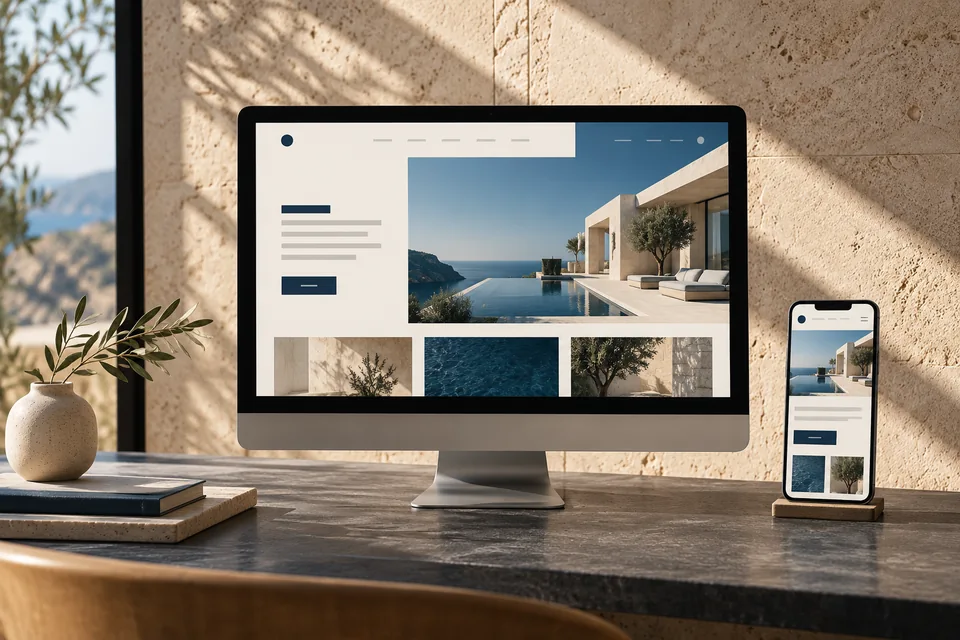
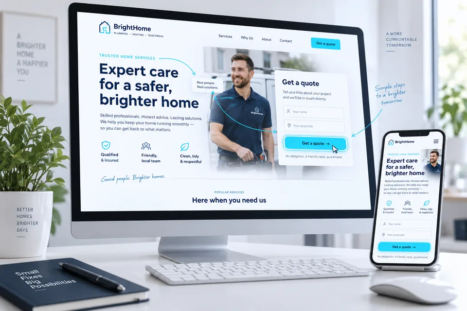
Landing page design starts when a visitor tries to understand where they have arrived. Images, headings, spacing and buttons should tell one story. Our landing page design approach connects brand character with information that helps customers decide. The challenge is to make a strong impression while keeping the service, value and next step clear—even during a quick mobile scroll.
Every visual decision should answer a question: what should visitors notice, understand or do here? That turns first impressions into a useful journey.
Before colors: define the offer and reading order
Good hierarchy depends on knowing what matters. Define the service, audience and primary action; separate immediate essentials from later detail. The headline starts the conversation, while supporting copy supplies context.
Sketch an opening, explanation, proof, concern and inquiry path before styling. Ask someone unfamiliar with the business what they understood. Large images and complex animation cannot fix an unclear service.
Our business landing page planning guide provides a starting brief. Then choose a style that suits the brand, available content and customer's decision.
Before choosing a visual language, establish a clear reason to choose the business. Landing page differentiation connects provable strengths with the questions design needs to answer.
Recognize the brand.
Understand the offer.
- Attention
Contrast, composition and imagery
- Understanding & trust
Readable messaging and well-placed evidence
- Action
A clear, easy next step
Connect the opening headline, image and action
The first screen provides a starting point. A clear headline, brief explanation and relevant image reduce effort. A primary button offers the next step, supported by details such as scheduling expectations. Everything need not fit above the fold.
Choose what receives the most visual weight. When every headline, image and button competes equally, attention fragments. Use size, contrast and empty space to guide the eye instead of emphasizing everything.
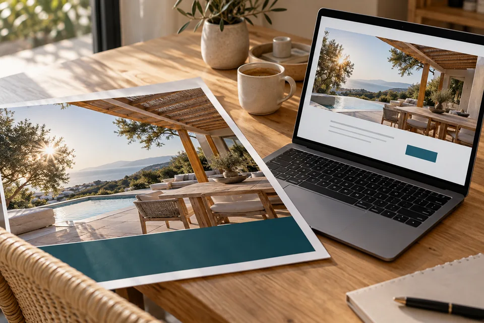 From ad to landing page
An ad sets an expectation. The page's image, headline and offer should continue that conversation and make the next step clear.
Create reading rhythm with type and spacing
Marketing copy should support scanning and sustained reading. Use a consistent hierarchy for the main heading, sections, body and notes. Focused paragraphs and comfortable line lengths help readers continue. Elegant desktop text can become cramped on a phone.
- Maintain sufficient text contrast, including over photography.
- Separate topics with space and group related elements closely.
- Make links recognizable beyond a subtle color change.
- Check phone numbers, brand names, addresses and mixed-language text.
- Enlarge text and verify that information and controls remain available.
Expressive headings can coexist with readable explanations. W3C guidance emphasizes contrast, recognizable interactive elements and clear labels. W3C accessible design guidance
Choose images that explain the business
An image can show a product, process or service environment. Define its role, then test size and cropping across screens. A great landscape photo may lose its key detail in a square card; tiny logo text may blur on mobile.
Start with high-quality originals and create suitable display sizes. Sending huge files for tiny images wastes bandwidth, while enlarging small originals cannot restore missing detail. Keep logos crisp, using vector assets when appropriate.
Add context to project images: what they show and why it matters. Label illustrations so they cannot be mistaken for documented client work. Explore our work and brand gallery for visual examples.
Choose imagery around what customers are evaluating. An interior designer's page should show projects and design decisions. A law firm page should introduce practitioners, practice areas and the first conversation.
Explore these decisions in our landing page examples guide, which analyzes messaging, proof and action before adopting a visual solution.
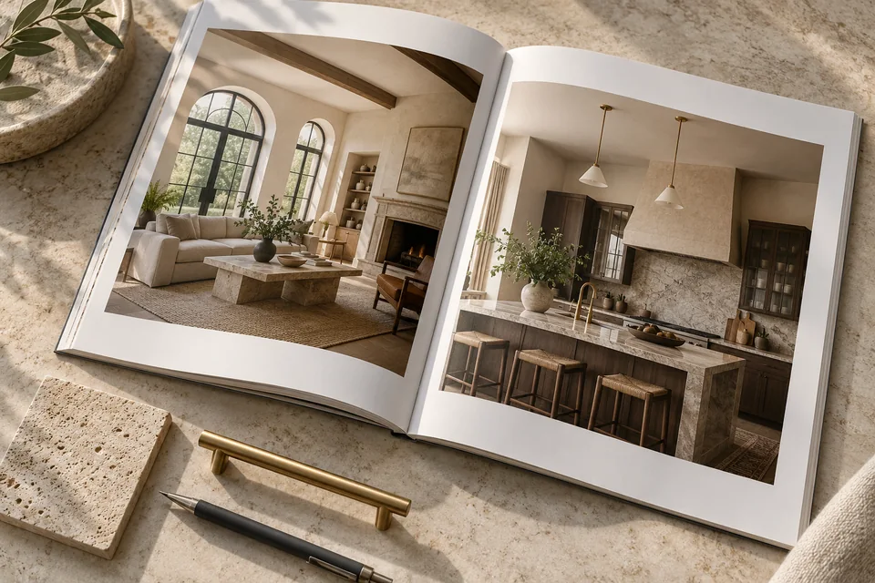 Portfolio & proof
A real business should show its own work, explain what was delivered and highlight relevant details. This image illustrates one way to present a portfolio.
Give mobile its own reading sequence
Desktop can place images and explanations side by side. On a phone, decide which appears first and what visitors know before the next element. Responsive design is a decision about sequence, priorities and use—not merely smaller fonts in one column.
| Element | Review question | Design direction |
|---|---|---|
| Opening | Can visitors understand the offer without scrolling far? | A concise headline, explanation and appropriate image crop |
| Long-form content | Can people find a topic without losing their place? | Clear headings and a table of contents where useful |
| Fixed button | Does it cover content or the form? | Reserved bottom space and appropriate keyboard behavior |
| Comparison | Is the table readable and accessible? | Clearly indicated internal scrolling or an adapted layout |
Test open menus, validation messages and the on-screen keyboard. A page can look excellent in a screenshot but frustrate people entering details. The working experience matters as much as the opening image.
A usable layout must also load and respond well. Our fast landing page guide covers loading order, responsive images, stability and mobile actions.
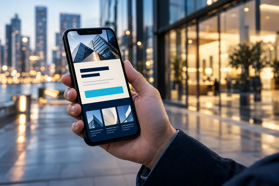 Mobile & performance
On mobile, the message and next action should be easy to find and use.
Treat the form as part of the design
Use persistent labels, clear required-field indicators and spacing that separates questions. Examples should help rather than replace field names. Phone and email inputs should offer appropriate keyboards and predictable behavior.
Multi-step forms should show progress, allow corrections and retain answers. Put actionable errors beside the relevant fields. Loading and confirmation are design states too; plan them with developers from the start.
A clear call to action describes what follows. A discovery request should not look like a purchase or confirmed booking. A short explanation of the next step may help more than another button effect.
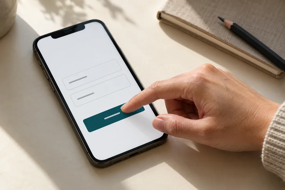 Mobile forms
Start with the information needed for the next conversation. Mark optional fields, explain what happens after submission and make buttons easy to tap.
Create a wow moment without losing the message
Motion can reveal layers, demonstrate personalization or add depth to a focal element. It works when it strengthens the brand idea without competing with reading. Consider one central visual moment and a calmer rhythm for most content.
- Keep text and buttons stable while people read.
- Offer reduced motion and respect device preferences.
- Keep background effects from intercepting clicks or hiding keyboard focus.
- Ensure effects do not delay the service explanation or primary action.
- Design a complete, clear static version too.
In dynamic landing page design, connect the first impression to what follows. A premium feel also comes from consistency, precise spacing and thoughtful responses to interaction.
Review the design before development
Use real content, including long headings, full testimonials and phone numbers. A design tested only with short phrases can break when the offer changes. Review desktop, phone and important form and menu states.
- A new visitor can explain the offer and audience.
- Every section has a role in the reading sequence.
- Visual assets are crisp, relevant and authorized.
- The primary action stands out from secondary options.
- Links, focus states and validation have been specified.
- The design remains usable with enlarged text and reduced motion.
Carry the approved design into landing page development with documented components, dimensions, behavior and content. Define responsibilities and live-site acceptance checks within the design and launch process.
Questions about landing page design
Does one button color always convert better?
No color guarantees results everywhere. The button needs contrast, readable text and an appropriate action. Evaluate color changes alongside messaging, placement and traffic.
Should every section look different?
Vary composition to create rhythm while keeping typography, colors and components consistent. Visitors can then recognize information and actions quickly.
Do advanced effects always hurt speed?
Not necessarily, but every effect has a cost to assess. Choose an efficient implementation, run only what is needed and provide reduced-motion alternatives. Test varied devices and connections.
From reading to project planning
Define screens, assets and approvals before implementation. Our landing page launch guide covers handoff and proposal scope. Explore our landing page service and the development and integration checks that complete the project.
Official reference: Google: images, alt text and page context
Images in this guide were created with AI for illustration. They do not depict actual clients, team members or campaign results.