

A long lesson list is not necessarily a reason to buy. Readers want to know whether the course fits them, how much effort it requires and what they can do with the knowledge. A strong sales page turns content into a clear learning path and acknowledges the student's work.
Start with learning outcomes, not hours of content
“Forty hours of content” describes volume, but also forty hours a busy person must find. Explain what students can create, assess or understand at each stage. A photography course might progress from understanding light to producing a product image series: a demonstrable learning outcome, without an earnings promise.
Separate skills from business guarantees. An advertising course can teach planning, setup and reporting; it cannot guarantee that every student wins clients or reaches a specific income. Precise outcomes make relevant sample lessons, exercises and evidence easier to choose.
 Talks & events
An agenda and introduction to the presenter help people understand what their time will deliver.
Explain who it fits and what it requires
State the starting level: beginners, experienced learners or existing users of a specific tool. List required equipment, software, language proficiency, practice time and prior knowledge. Even excellent advanced content will disappoint a student who lacks the prerequisites.
A short course-selection quiz can help, but must not hide basic information. Explain whether learning is self-paced, cohort-based or live. If prospects need an introduction before buying, a webinar landing page can support a preview and Q&A stage.
Build a curriculum that shows progression
Organize modules around developing capabilities rather than filenames. Explain what students learn, practice and produce. Expandable details are useful, but the overall path should be clear without opening every section. Offer a sample lesson representative of the pace and depth.
Match terminology to the audience. A beginner may not know why a technical topic matters; add the question it helps answer. A real exercise or course screenshot can explain more than generic “professionalism” and “success” icons.
Scroll horizontally to compare
| Stage | Skill | Deliverable |
|---|---|---|
| Foundation | Understanding light and backgrounds | A simple home photography setup |
| Practice | Composition and consistent photography | A series of images of one product |
| Application | Selection and editing | A presentation-ready gallery |
 Design & hierarchy
Color, spacing, imagery and typography create a hierarchy that guides attention to what matters.
How is the course delivered?
The same subject can support different offers depending on the level of guidance.
Learn at your own pace.
State access duration, starting level, exercises and support options.
Move forward together, step by step.
Session dates, feedback scope and practice time are part of the offer.
Build a shared professional language across your team.
Explain content customization, participant numbers and scheduling.
Illustrative scenarios. Adapt them to your business's actual offer.
Demonstrate experience with authentic evidence
The instructor photo, teaching sample and portfolio should support the course topic. Obtain permission for student work and explain the assignment and the student's contribution. Detailed feedback about the learning experience is more useful than praise that could describe any product.
An exceptional student's achievement is not a forecast for every enrollee. Without graduates yet, show course materials, instructor experience and a sample lesson. Our landing page differentiation guide helps you choose real evidence over exaggerated claims.
 Portfolio & proof
A real business should show its own work, explain what was delivered and highlight relevant details. This image illustrates one way to present a portfolio.
Package the offer so people can compare it
Explain what the price includes: content access, access duration, updates, community, sessions, feedback and support. If you offer tiers, identify who each fits and the meaningful differences. Bonuses should not obscure the curriculum or turn the offer into a hard-to-value gift list.
Show the full price and clear payment terms near checkout. Cancellation, use and access terms should match the product and receive appropriate review. A “Start learning” button should lead to a journey explaining what happens after payment. Plan the implementation with our landing page checkout guide.
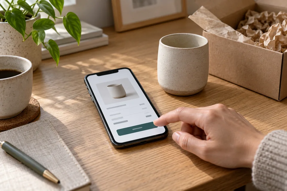 Purchasing & checkout
Explain price, inclusions and delivery before payment. Plan confirmations, failed payments and fulfillment too.
Test the journey from payment to lesson one
A successful checkout screen is only the start. Verify the payment provider's confirmation, grant access to the correct user and explain how to sign in. Test incorrect email addresses, forgotten passwords, missing messages and pending payments. Support at this moment shapes the start of the learning experience.
Keep mobile checkout concise without hiding the order summary. Prepare buyers for any external payment page and return them to clear instructions. Landing page development includes these integrations and tests as well as the sales page itself.
 Inquiries & follow-up
Connect each inquiry to its source, assign follow-up ownership and track qualification and the next conversation.
Separate the purchase from the learning experience
Track offer views, checkout starts, confirmed payments and access delivery. Where appropriate and supported, examine whether students start lesson one and where questions recur, respecting privacy preferences. Abandonment is not always a design problem, and a sale does not prove expectations were set correctly.
Compare confirmed purchases, refunds and acquisition costs over consistent periods. Test offer copy, a sample lesson or support explanations separately. For a new course, the product launch landing page guide helps plan an early interest-validation stage.
Prepare the brief before design begins
Gather an approved curriculum, learner profile, sample lesson, instructor details, access terms, payment options and learning-platform information. Add the three most common buyer concerns. This lets the page follow customer questions rather than the order of your files.
Our landing page service starts with the offer and what follows it. For courses, content, design, checkout and access must work together. Defining them together creates a consistent journey from ad to first lesson and a clear launch checklist.
Ready for the next step?
Check off what you already have. This checklist stays on this page; selections are not submitted or saved after a refresh.
Common questions
Should the page show the price?
A fixed-price product benefits from transparent pricing. For customized team training, explain what affects the quote and request the details needed to prepare it.
Is video essential for selling a course?
No, but a real teaching clip helps people assess the instructor's style. Include a written summary so the information remains available without watching.
How many purchase options should we offer?
Only options with meaningful differences. Two clear choices may be enough; avoid artificial tiers created solely to make another look attractive.
Images in this guide were created with AI for illustration. They do not depict actual clients, team members or campaign results.