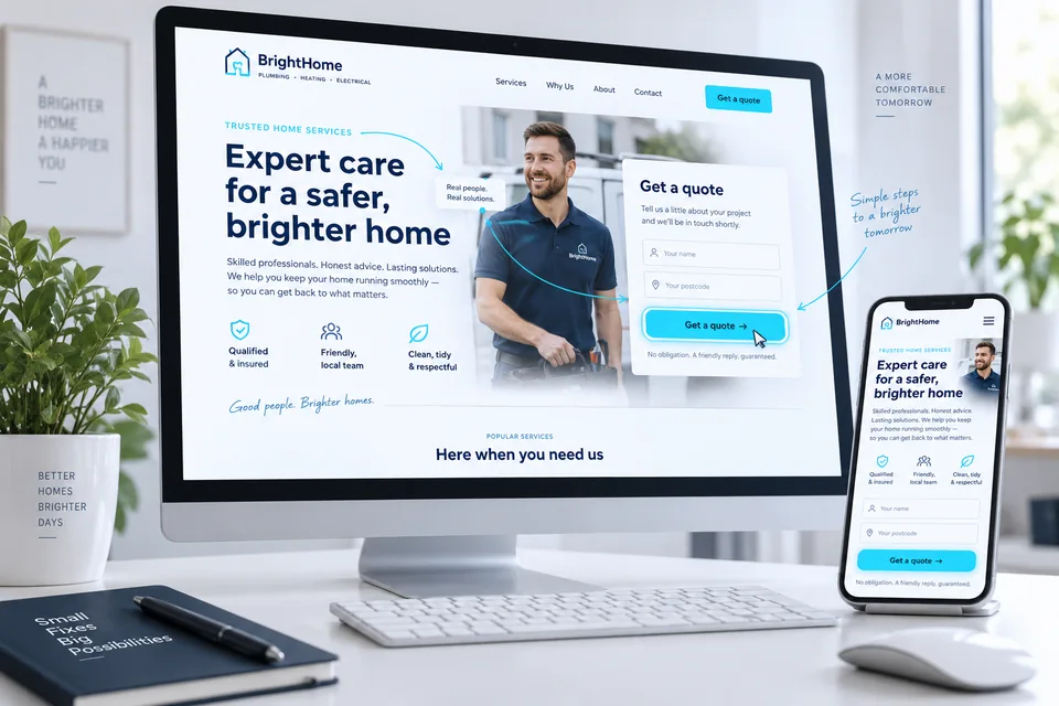
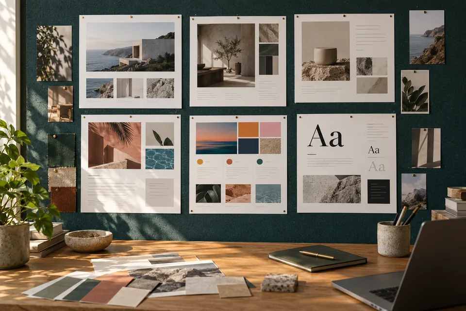
When browsing landing page examples, colors, motion and large images naturally draw attention. Also ask which decision each section helps the customer make. We'll examine three illustrative scenarios and a structured way to learn from examples without copying a design that does not fit your audience.
Understand the context before judging the design
A page suited to focused search traffic may not suit people discovering a brand through social video. Ask who the visitor is, where they came from, what they know and what they should do next. Context explains why some pages can be brief while others need detail, demonstrations and FAQs.
Open examples on desktop and phone. Review the opening, evidence sequence and contact path. Our work gallery can help explore visual styles, but performance requires data and cannot be inferred from appearance.
Example one: a service with a clear customer need
Consider someone seeking AC installation in an apartment. Confirm the service in the headline, then explain what planning or an estimate requires: room type, installation location and service area. Actual installation photography is more useful than a generic image of a gleaming building.
“Let's find the right setup for your apartment” could open a short needs form. Explain who responds and what to prepare. Our service-business demos show how different jobs need different openings. Neither forms nor purchase readiness are universal.
 Service businesses
Images showing the work help customers understand what you do. For real projects, prioritize original photography from the field.
Example two: a course explaining its learning experience
An impressive instructor photo is not enough. Visitors need learning outcomes, audience fit and the effort required. A useful sequence might be outcomes, intended learners, sample lesson, curriculum and access terms. Evidence should support teaching quality, not merely popularity.
The first action might be watching a sample before purchasing. Do not copy a service-business contact form when customers can buy directly. Our online course landing page guide connects the offer, support and access after payment.
 Online courses
A glimpse of a lesson, exercise and finished work helps people assess whether the teaching style fits them.
One structure. Three different decisions.
Illustrative content examples—not performance data or promised outcomes.
Plan an installation that fits your space.
Explain fit, coverage and the estimate process.
From the first lesson to something you create yourself.
Show the starting level, practice and a sample lesson.
Explore the home, floor plan and neighborhood.
Connect the gallery to property details and a viewing request.
Illustrative scenarios. Adapt them to your business's actual offer.
Example three: a property that needs qualification
Connect real estate images to facts: the property shown, location and layout. Label renderings, and do not imply a model-home photo depicts every unit. Useful floor plans, neighborhood details and current availability may matter more than a long opening video.
A form identifying property interest prepares the scheduling conversation. Distinguish information requests from confirmed appointments. Our real estate landing page guide maps this journey. Visuals should inspire exploration while facts support a practical decision.
 Properties & developments
Images create interest, but property fit also depends on location, layout, condition and practical details. This is an illustration, not a property offered for sale.
Evaluate each section by its purpose
Ask what each section adds. Repeated messages may be combined; promises without explanation or proof may need another step. A page is a sequence of answers, not a collection of fashionable components.
In landing page design, assign each component a purpose before choosing its form. A testimonial can be a card, quote or video; what matters is relevance to the preceding claim and permission to use it.
Scroll horizontally to compare
| Element | Question it answers | A sign of confusion |
|---|---|---|
| Opening | Am I in the right place? | A slogan that names neither service nor audience |
| Evidence | Why should I trust this offer? | An attractive image unrelated to the claim |
| Process | What happens if I reach out? | A button without an explanation of the next step |
| Form | What information is needed to start? | Many questions with no clear purpose |
 Design & hierarchy
Color, spacing, imagery and typography create a hierarchy that guides attention to what matters.
Test the example in real usage conditions
On a phone, inspect heading wraps, image meaning and one-handed access to actions. Test forms with the keyboard open. Floating buttons, cookie notices and accessibility tools each serve a purpose, but together can cover content.
Motion can direct attention, but should not move a button during a tap or hide information from people preferring reduced motion. Our fast, usable landing page guide goes beyond screenshot reviews.
Separate impressions from testable hypotheses
State what a component should improve. “A project photo beside the promise will help people understand the deliverable” is testable through usability research and data. “This page looks successful” is not enough. Never copy another company's testimonials, results or credentials.
Where testing is feasible, compare reasonable conditions and consistent qualification criteria. More button clicks require follow-through analysis. See the full method in our measurement and conversion optimization guide.
 Measurement & conversion
Separate visits, actions and qualified inquiries to identify what really needs improvement.
Turn inspiration into a usable brief
Choose three to five examples and explain what you like in each. You might borrow a color direction from one, an explanatory approach from another and form behavior from a third. Note what does not fit: aggressive tone, excessive motion or unavailable video assets.
Add the service, audience, traffic source and intended action. A landing page planning conversation can turn inspiration into a suitable structure. Examples become decision tools rather than a vague request for “something similar.”
Ready for the next step?
Check off what you already have. This checklist stays on this page; selections are not submitted or saved after a refresh.
Common questions
Can a screenshot tell us whether a page converts?
No. You can assess clarity, hierarchy and usability, but performance requires traffic data, a conversion definition and business context.
Should we use a competitor's template?
Learn from its structure and the questions it answers. Your content, branding and assets must be original or licensed, with decisions suited to your offer.
How many examples should we bring a designer?
A few with specific explanations beat dozens of context-free links. Identify what each teaches and adopt only what suits your audience.
Images in this guide were created with AI for illustration. They do not depict actual clients, team members or campaign results.